Most Marketing Dashboards Are Measuring Activity, Not Causality
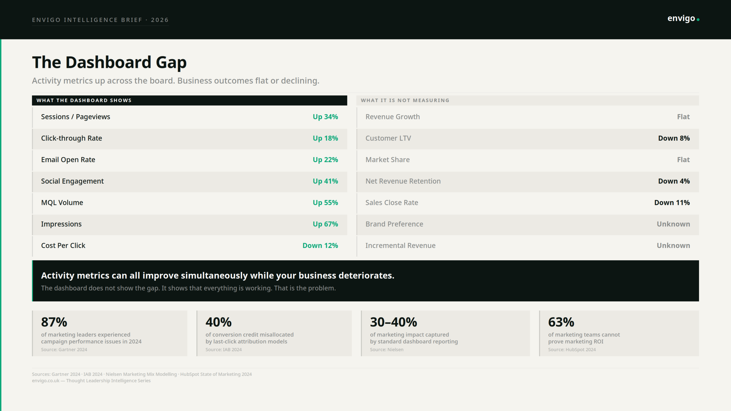
Your dashboard is full of green arrows. Sessions up. CTR up. MQL volume up. Engagement up. Open rates up. And your CEO is asking why revenue is flat.
This is not a bad quarter. It is a measurement architecture problem. The dashboard is working exactly as designed. The problem is what it was designed to measure.
The Correlation Trap
Every metric on a standard marketing dashboard was chosen because, at some point, it correlated with an outcome someone cared about. Sessions correlated with revenue. CTR correlated with pipeline. Email open rates correlated with engagement. The correlation was real. The inference that followed was not.
Correlation in the data is not causation in the business. A high email open rate does not cause revenue. It correlates with revenue when the people opening emails are the right people, reading the right messages, at the right point in a genuine buying process. The moment you optimise for open rate directly. crafting subject lines designed to win the inbox rather than serve the reader, you can decouple that correlation entirely. Open rates climb. Trust erodes. Lifetime value falls. The dashboard shows success. The business shows something different.
This is not a flaw in any particular metric. It is a structural property of how metrics work. Every activity metric is a proxy for an outcome. It approximates something that matters. It works as a proxy only when the underlying system that produced the correlation is left undisturbed. The moment you target the proxy, you disturb the system. The proxy detaches. The outcome does not follow.
Goodhart’s Law Has Been Running Inside Your Marketing Team for Years
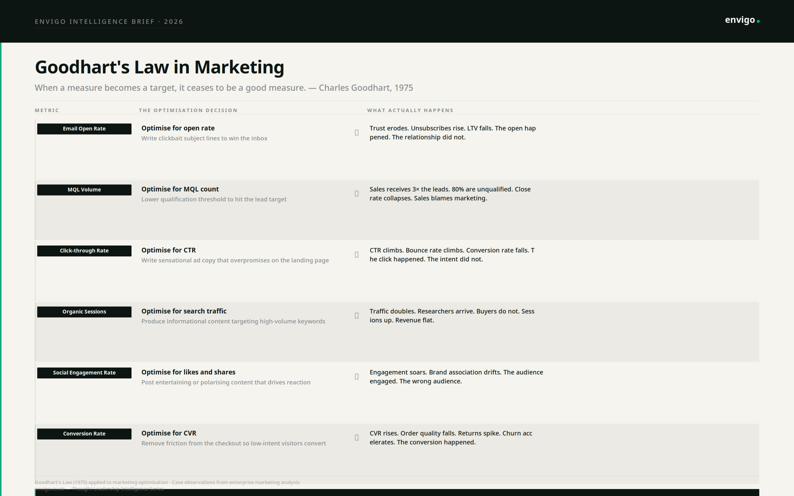
Charles Goodhart was a British economist who observed in 1975 that “when a measure becomes a target, it ceases to be a good measure.” He was describing monetary policy. He was describing your marketing dashboard.
The mechanism is not malicious. It is rational. Teams optimise for what they are measured on. When MQL volume appears on the dashboard and carries a target, the qualification threshold quietly lowers. When conversion rate is the KPI, friction gets removed so aggressively that low-intent visitors convert, churn accelerates, and the unit economics collapse. When social engagement is the metric, content shifts toward reaction rather than resonance. Each of these decisions is locally rational. Each makes the dashboard look better. Each can make the business worse.
What appears on a dashboard communicates organisational priority. It tells everyone what success looks like, which problems are worth solving, and which work counts. This is why dashboards are not merely a measurement tool. They are an incentive design decision. The metrics you choose determine the behaviour you produce.
The Six Ways Activity Metrics Detach from Outcomes
The following is not a list of mistakes. It is a list of rational optimisations that produce irrational business outcomes, each a direct consequence of measuring activity and calling it performance.
- Email open rate. Teams optimise for open rate. Subject lines become clickbait. Opens climb. The relationship with the reader deteriorates. Unsubscribes rise. The segment you worked hardest to build quietly loses trust in you. The open rate never shows this.
- MQL volume. Teams hit MQL targets by lowering the qualification bar. Sales receives three times the leads. Eighty percent are unqualified. The sales team spends the same time sifting more noise. Close rate falls. Sales-marketing alignment collapses. The MQL volume looks fine.
- Click-through rate. Ad copy gets optimised toward sensation. CTR climbs. Bounce rate climbs with it. Conversion rate falls because the people who clicked were not the people who were going to buy. The click happened. The intent did not.
- Organic sessions. SEO strategy targets high-volume informational keywords. Traffic doubles. Researchers arrive. Buyers do not. The content serves people who needed an answer, not people who needed a solution. Sessions up. Pipeline flat.
- Social engagement. Entertaining or polarising content drives reactions. Engagement rate soars. The audience shifts toward people interested in the content rather than people interested in the category. Brand association drifts. The engagement is real. The audience is wrong.
- Conversion rate. Friction removal goes too far. Low-intent visitors convert. Order quality falls. Returns spike. Churn accelerates. The conversion rate is excellent. The customers it produced are not.
In each case, the metric and the outcome that originally produced it have been separated by the act of optimisation. The dashboard cannot see this. It was not built to see this.
What Causality-Oriented Measurement Actually Requires
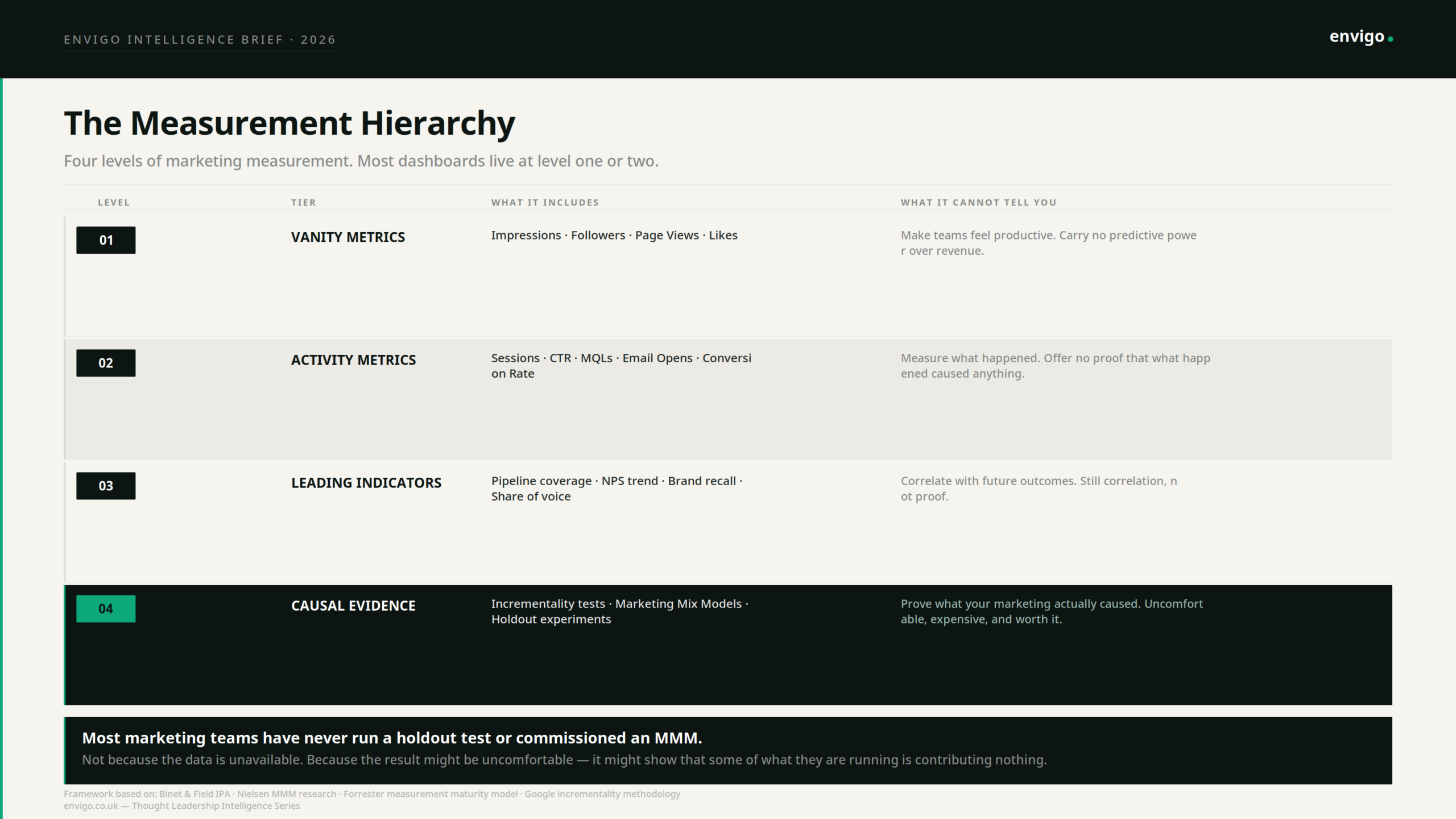
Most marketing teams have never run a holdout test. Not because the methodology is unavailable, but because the result might be uncomfortable. A holdout test, withholding marketing from a randomly selected control group and measuring the revenue difference, is the closest thing marketing has to a controlled experiment. It does not measure what happened. It measures what would not have happened without the marketing.
The results, when organisations do run them, are consistently surprising. Channels that appear to drive significant conversion volume in last-click reporting are revealed to generate little to no incremental revenue when the holdout shows that the same buyers would have converted without the exposure. Last-click attribution misallocates approximately 40% of conversion credit, according to IAB analysis. The channels receiving that credit are not causing the conversions they appear to own. They are present at the end of a journey that was already going to end there.
Marketing Mix Modelling operates on a similar causal logic but across longer time horizons. Econometric models analyse historical spend and outcome data to isolate the independent contribution of each channel to revenue. The consistent finding, across organisations that commission these models, is that their spend allocation looks nothing like what their dashboard suggested. Brand-building investment, which attribution models undervalue systematically because it operates over months rather than days, routinely shows stronger causal contribution to revenue than performance channels whose attribution share appears dominant. Nielsen research suggests standard marketing dashboards capture only 30 to 40% of total marketing impact. The remainder flows through brand equity, dark social, and long-term effects that last-click models were never designed to see.
The Organisational Problem Behind the Measurement Problem
None of this is a data problem. The data to do better exists. Incrementality testing is methodologically established. Marketing Mix Modelling has been available to enterprise marketers for decades. First-party data infrastructure is more accessible than it has ever been.
The problem is structural. Dashboards were built to make measurement easy, not to make measurement true. Activity metrics are cheap to collect and fast to report. Causal evidence is expensive, slow, and frequently inconvenient. The dashboard industry optimised for what could be measured confidently in real time, which is not the same thing as what causes outcomes.
This creates a specific organisational dynamic. Teams become fluent in the language of the dashboard and gradually lose the ability to distinguish between marketing that is performing and marketing that is measuring well. These are different things. A campaign can produce excellent metrics while contributing nothing to revenue. A brand investment can produce almost no dashboard signal while building the preference that closes deals six months later. The dashboard cannot tell you which is happening because it was not built to answer causal questions.
The measurement system also determines what evidence is presented to leadership. When dashboards report activity metrics, those are the numbers that appear in board updates, that inform budget decisions, and that shape the organisation’s understanding of where marketing is working. The invisible contribution of brand, the untracked influence of dark social, the long-term compounding of trust, none of this appears. Decisions get made on the basis of what is measurable, not on the basis of what is true.
What a Causally-Oriented Measurement System Looks Like
This is not a call to abandon dashboards. It is a call to understand what they are for, build them accordingly, and supplement them with the evidence they structurally cannot provide.
Activity metrics remain useful as operational signals. CTR tells you whether an ad is generating interest. Open rates tell you whether subject lines are working. Sessions tell you whether content is attracting traffic. These are diagnostic tools. They are useful for identifying problems and testing hypotheses. They are not useful as definitions of marketing success.
Leading indicators sit closer to outcomes. Pipeline coverage, net promoter score trend, brand recall, and share of voice all correlate with future revenue in ways that are more stable than activity metrics. They are still correlates, not causes. But they are better proxies.
Causal evidence requires deliberate investment. Incrementality tests require a hold-out methodology and the willingness to withhold marketing from a control group and accept the short-term revenue cost of doing so. Marketing Mix Models require econometric expertise and longitudinal data. Neither is operationally convenient. Both are the only way to know whether the marketing budget is causing anything.
The organisations that have invested in causal measurement consistently report the same finding: their spend allocation changes significantly when they can see what is actually causing revenue rather than what is correlated with it. Brand investment goes up. Some performance channels that appeared dominant under last-click attribution are revealed to have limited incremental contribution. The budget gets more efficient. Not because they spent less, but because they spent on what was actually working.
The dashboard will continue to show green arrows. That is not its failure. It is its design. The question is whether the organisation has built the additional infrastructure to know whether those arrows represent genuine marketing impact or measurement artefacts that have decoupled from the outcomes they were originally meant to proxy.
Most have not. Most have built excellent reporting on top of a causal void. The metrics are precise. The attribution is confident. The causality is largely assumed.
The cost of that assumption is not visible on any dashboard. Which is, of course, exactly the problem.
Sources: Charles Goodhart (1975) — On the Management of Money Supply · Nielsen Marketing Mix Modelling research · IAB 2024 Attribution Report · Gartner 2024 CMO Survey · HubSpot State of Marketing 2024 · Binet and Field — The Long and the Short of It (IPA) · Forrester Measurement Maturity Model
Where to go next
If you’re dealing with comparable constraints, we’re open to a conversation.