
Not through falsification. Nobody changes a number. The lie is more systematic and considerably harder to address because it does not require intent. It requires only that the people presenting the data are the same people being evaluated on what it shows.
That is almost every marketing dashboard in existence.
How It Starts
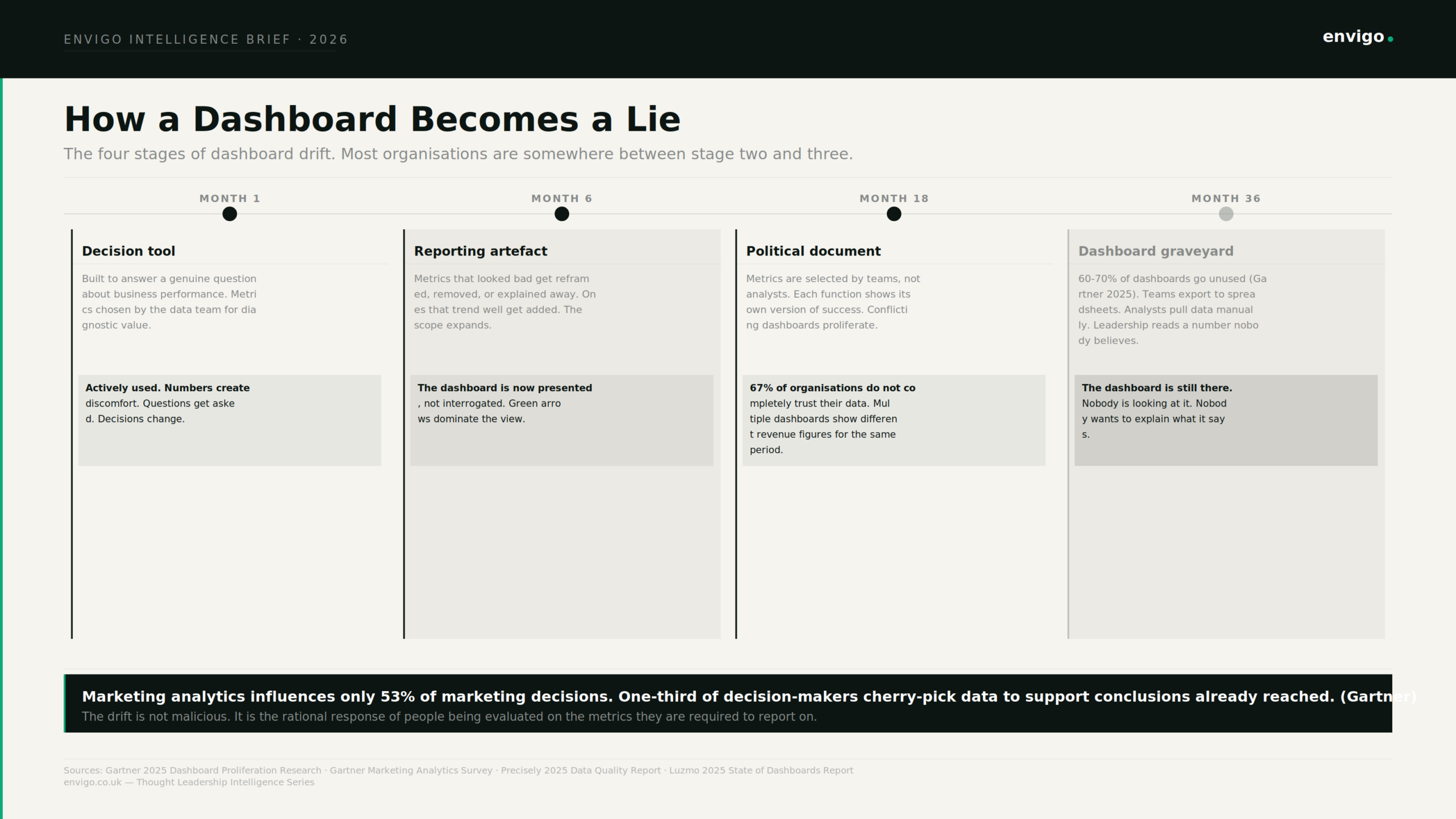
A dashboard begins as a genuine attempt to answer a question. What is happening to our conversion rate? Where is the pipeline coming from? Which channels are generating qualified leads? The initial metrics are chosen for diagnostic value. The numbers create discomfort. That discomfort produces questions. Those questions produce decisions that change behaviour. The dashboard is working.
Then a few things happen in sequence, and none of them feel like a problem at the time.
A metric that consistently trends downward disappears. Not through deletion. It is simply never prioritised in the next build, never added to the presentation, never mentioned again. A comparison period gets quietly adjusted. The same conversion rate improvement looks compelling versus last quarter and unremarkable versus last year. A segment that is underperforming gets averaged into a blended number that reads acceptably. The problem disappears into the aggregate.
Vanity metrics persist on dashboards for a specific reason. They are easy to measure, they consistently trend upward, and they look good to stakeholders, making them politically safe to report.
None of these adjustments require anyone to lie. Each one is a locally defensible decision. The cumulative result is a dashboard that has drifted from its original purpose (answering a question honestly) to a new purpose: proving that the team responsible for the metrics was successful.
What the Research Shows
Marketing analytics influences only 53% of marketing decisions, according to Gartner. One-third of respondents reported that decision-makers cherry-pick data to tell a story that aligns with their preconceived decision or opinion. A further quarter does not review the analytics provided at all. Roughly a quarter of respondents said decision-makers rely on gut instinct to ultimately make their choice. Michael BritoMichael Brito
It is the modal behaviour in marketing organisations that have invested in dashboards and analytics for years. The investment did not produce data-driven decisions. It produced a data vocabulary around decisions that were made on instinct, seniority, and previous belief.
60 to 70% of dashboards go unused. Gartner research describes what happens as a dashboard graveyard. Expensive investments quietly abandoned within months of launch. 72% of users regularly abandon dashboards in favour of spreadsheets. 77% of IT decision-makers do not trust the data in their dashboards. 67% of organisations do not completely trust their data for decision-making, up from 55% the previous year.
The numbers should stop at one question. If organisations have invested this heavily in analytics and data infrastructure, why do the majority not trust what it shows, and why does most of it go unused? The answer is not data quality in the technical sense. It is data credibility in the political sense. When multiple dashboards show different revenue figures for the same period, the organisation stops trusting any of them. When the team presenting data is also the team whose performance it measures, the audience already knows what the presentation will show before it starts.
The Mechanisms Are Specific
The drift from decision tool to political document follows a consistent pattern. It is worth naming the mechanisms precisely because each one is individually rational.
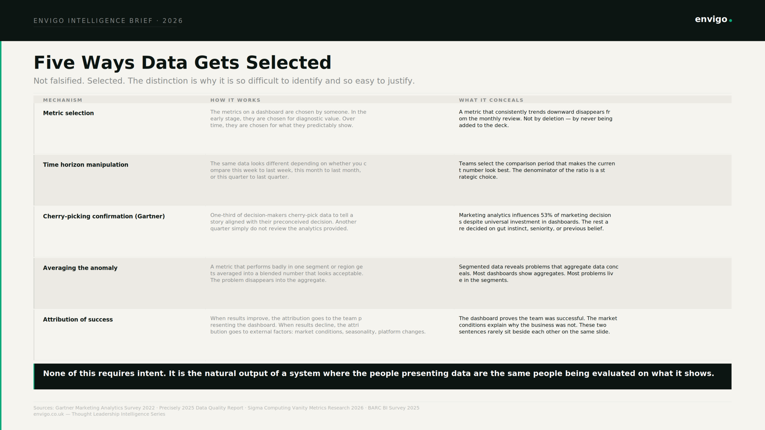
Metric selectionWho chose what appears on the dashboard? In an early-stage programme, an analyst chooses metrics for diagnostic value. Over time, metrics are chosen by teams for predictability. If a metric consistently shows the right trend, it gets added. If it does not, the question of whether to include it never gets raised. The dashboard is not falsified. It is curated. |
Time horizon manipulationThe same performance looks different depending on the comparison period. A 3% conversion rate improvement reads as strong versus last week, modest versus last quarter, and poor versus last year. The selection of comparison periods is a strategic decision that is almost never made explicit. |
Aggregation of problemsA metric that is performing badly in a specific segment, region, or channel gets averaged into a blended number that reads acceptably. The segment data that reveals the problem is available. It is not on the slide. Segmented data reveals problems that aggregate data conceals. Most dashboards show aggregates. |
Attribution of successWhen metrics improve, the attribution goes to the team presenting the report. When metrics decline, the attribution is contextualised: market conditions, seasonal patterns, platform algorithm changes, macroeconomic headwinds. The dashboard proves the team was successful. External factors explain why the business was not. These two sentences are almost never placed beside each other on the same slide. |
The Problem Is Not Measurement. It Is Who Measurement Is For.
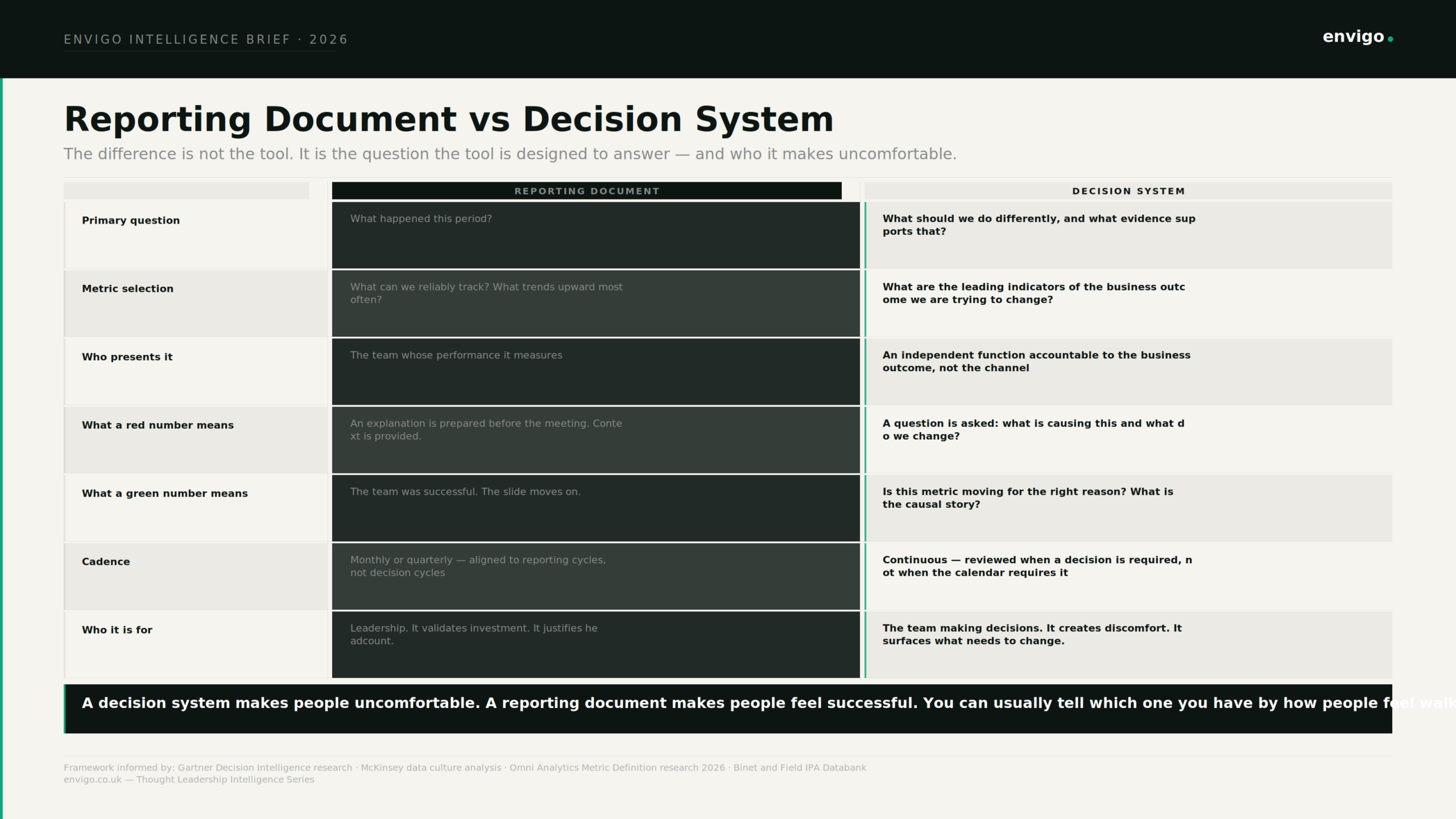
The deeper issue is the purpose the dashboard was built to serve. Most marketing dashboards are built to answer the question “what happened this period?” and to be presented by the team responsible for what happened to the leaders evaluating whether that team is performing.
A genuine decision tool serves a different master. It is designed to answer the question “what should we do differently?” That question is useful only when the data it draws on is not selected by the people whose decisions it will evaluate. It requires that a red number produce a question rather than a contextual explanation. It requires that a green number produce scrutiny rather than validation.
Most dashboard evaluations start with the wrong question. Teams ask “does it look good?” before they ask “can we trust the numbers?” The result is a dashboard that gets built, shared with leadership, and quietly abandoned because nobody can agree on whether the number on the first slide matches the one in the finance model.
Only 25% of enterprise data professionals believe their organisation’s decision-making process is data-backed. Nearly one-third of companies that rarely or never use data to make decisions say the reason is that decision-makers prefer their gut or experience over data. These two findings point at the same thing from different angles. The data infrastructure exists. The decisions are not being made with it. The reason is not a lack of capability. It is that the data, as presented, is no longer trusted to be a neutral account of what happened. Forrester
What a Decision System Actually Looks Like
The distinction between a reporting document and a decision system is not visual. It is structural and it is political.
A decision system makes people uncomfortable. A reporting document makes people feel successful. The most reliable test is to ask how people feel walking out of the monthly review. If the meeting produced a shared sense of what the team is doing well, it was a reporting document. If it produced a shared sense of what the team needs to change and who is responsible for changing it, it was a decision system.
Decision systems share several structural features. The metrics are chosen by someone independent of the team being measured, based on their relationship to the business outcome rather than their tendency to trend in a favourable direction. The data is segmented rather than aggregated, because problems live in segments. The comparison periods are fixed in advance and not adjusted based on what makes the current period look best. A declining metric produces a structured question about cause, not a prepared explanation. A growing metric produces a question about whether the causal story is understood, not a declaration of success.
Gartner’s top analytics trend for 2025 was the transition from data-driven to decision-centric organisations. The distinction is precise: a data-driven organisation measures what happened. A decision-centric organisation uses measurement to change what happens next. Cometly
The measurement is the same. The purpose is different. And the purpose determines whether the dashboard, three years after its launch, is still answering questions or only proving that everyone was successful.
Sources: Gartner Marketing Analytics Survey 2022 · Gartner Data and Analytics Top Trends 2025 · Gartner Dashboard Proliferation Research 2025 · Precisely 2025 Data Quality Report · Luzmo 2025 State of Dashboards Report · Sigma Computing Vanity Metrics Research 2026 · Omni Analytics Metric Definition Research 2026 · Stream Data Systems Dashboard Delusion Analysis 2026 · Forrester Data Culture and Literacy Survey 2023
Where to go next
If you’re dealing with comparable constraints, we’re open to a conversation.